
This isn’t the first time I’ve changed the layout on this blog, and knowing me... it probably won’t be the last.
Ever since I moved to Squarespace last year, there were a few things about my new design that were aesthetically pleasing but turned out to be fairly impractical. I wanted to keep the minimal, polished vibe but make a few adjustments just so the site would be easier to maintain on my end (which is important, as I plan to focus on this blog a lot this year). I thought I'd share what I decided to change, as I know a lot of my readers have blogs themselves and could be thinking of giving their own platform a makeover.
I made a list of all the features I wanted, and once I finished my list it became obvious that I was going to have to pick a new template, but eventually I found one that was as close as possible to what I had in mind (well, after a few CSS hacks). If you're thinking of giving your blog a makeover, or starting a brand new one, I definitely recommend making a list of all the features you want in your layout as there's so much choice out there.
Blogs are very personal, and everyone's preferences are going to be different, but here’s what I was looking for when I was rearranging things over here:

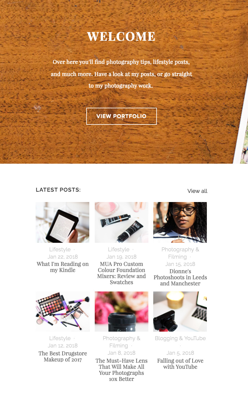
A Very Minimal Theme
I like a classic layout, with a white background and black text. I know that’s not particularly groundbreaking, and it might not look like I put a huge amount of thought into my blog designs - but trust me, I really do! I like the blog to look fairly minimal because I want my photographs to be the centre of attention. It’s the same reason an art gallery has white walls.
A Sidebar
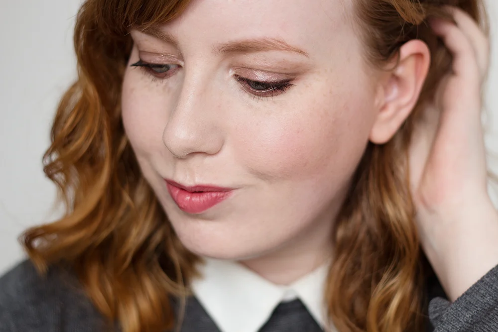
Again, a sidebar isn’t revolutionary, and I’ve seen a few more established bloggers dropping them from their themes over the years. That’s understandable if everyone already knows who you are, but I really missed mine when I moved to Squarespace. If someone new where to stumble across a blog post, there was no information on the page about who I am or what other content was avalible. Maybe sidebars aren’t for everyone, but as my posts don't usually contain photographs of me, so I feel like it's nice to have my face and details somewhere... plus, there’s room for the following:
Space for Adverts
This is another thing I’ve noticed a lot of larger bloggers dropping from their layouts. I guess they might not need it, as when you have a larger audience the majority of your income comes from affiliate links and sponsored posts. However, my following is rather small in the grand scheme of things, so for me adverts are still a necessity. I feel like they fit there a lot better with my current layout than they did before.
Bloglovin' Icons
I’ve been getting a lot of traffic from Bloglovin', so I really want to make sure that all my new readers know they can follow me there if they want to. I now have a little plus icon on my menu, and a widget in my sidebar. Whether you're new to blogging or not, I'd recommend having a Bloglovin' icon or widget somewhere on your page (preferably before the fold - that means the part you see before scrolling down) as most people will want to follow you on there.
A Homepage That’s Easier to Update
Without rambling on too much about the technical side of things, my new layout is designed to update automatically when I add tags to my posts. This means I can spend less time phaffing around with updating things, and more time making the content. Perfect!
After all the changes I made, I'm pretty happy with the way things are looking over here - but of course, this is me we're talking about, so I could decide to change it all again in a few weeks.